A study conducted by UCLA concluded that people exposed to cluttered spaces actually have higher levels of the stress hormone cortisol(a). Cortisol disrupts nearly the entire body and negatively impacts heart health and the immune system to name a few according to a research paper conducted at Dartmouth college(b).
Why then are we still designing cluttered cord and swing arm happy offices? Unfortunately, traditional design has not advanced in the last 20 years since the arrival of the IO cam, digital sensors, apex locators, and all the other table top corded equipment that now inhabits your operatories, cords and all.
If you don’t believe this go into your treatment room and look around 360 degrees. I bet you see:
- “Clean” glove boxes on the wall or cabinet
- Swing arms with many cords, monitors, overhead lights etc
- Bottles of soap and sanitizer on the counter/wall
- Delivery tubing for the Dr and assistant dangling on or above the floor
- Table top equipment with cords galore
- More cords
Operatory with typical clutter resulting from rear delivery and technology not fully integrated
You get the idea. This clutter is very difficult to clean and the mess screams DIRTY to the patients, not to mention it raises the cortisol levels of your team, patients, and Dr’s.
The secret to avoiding this is planning cabinetry and technology integration. These types of operatories can eliminate the mess increase production and efficiency thus rebranding your practice to one that is crisp, clean, and state of the art:
Tip #1 - 3 monitors
Utilizing 3 monitors allows each one to perform a specific function. The rear monitor(1) is for non-patient facing software e.g. scheduling, and charting software. The chair mounted monitor(3) is for patient communication and in-procedure Dr assistance to show X-rays, 3D etc... Finally the ceiling mounted monitor(2) allows for patient entertainment during the procedure.
Operatory with 3 dedicated monitors
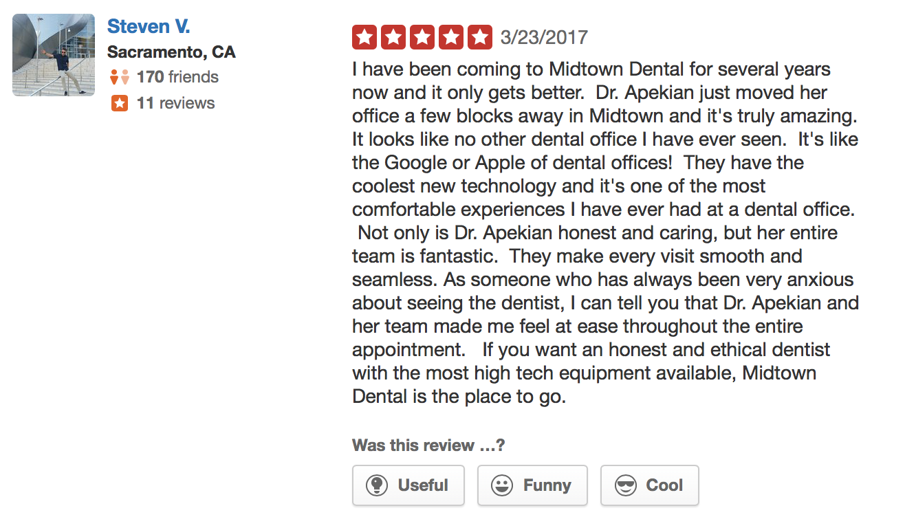
Actual yelp review from patient
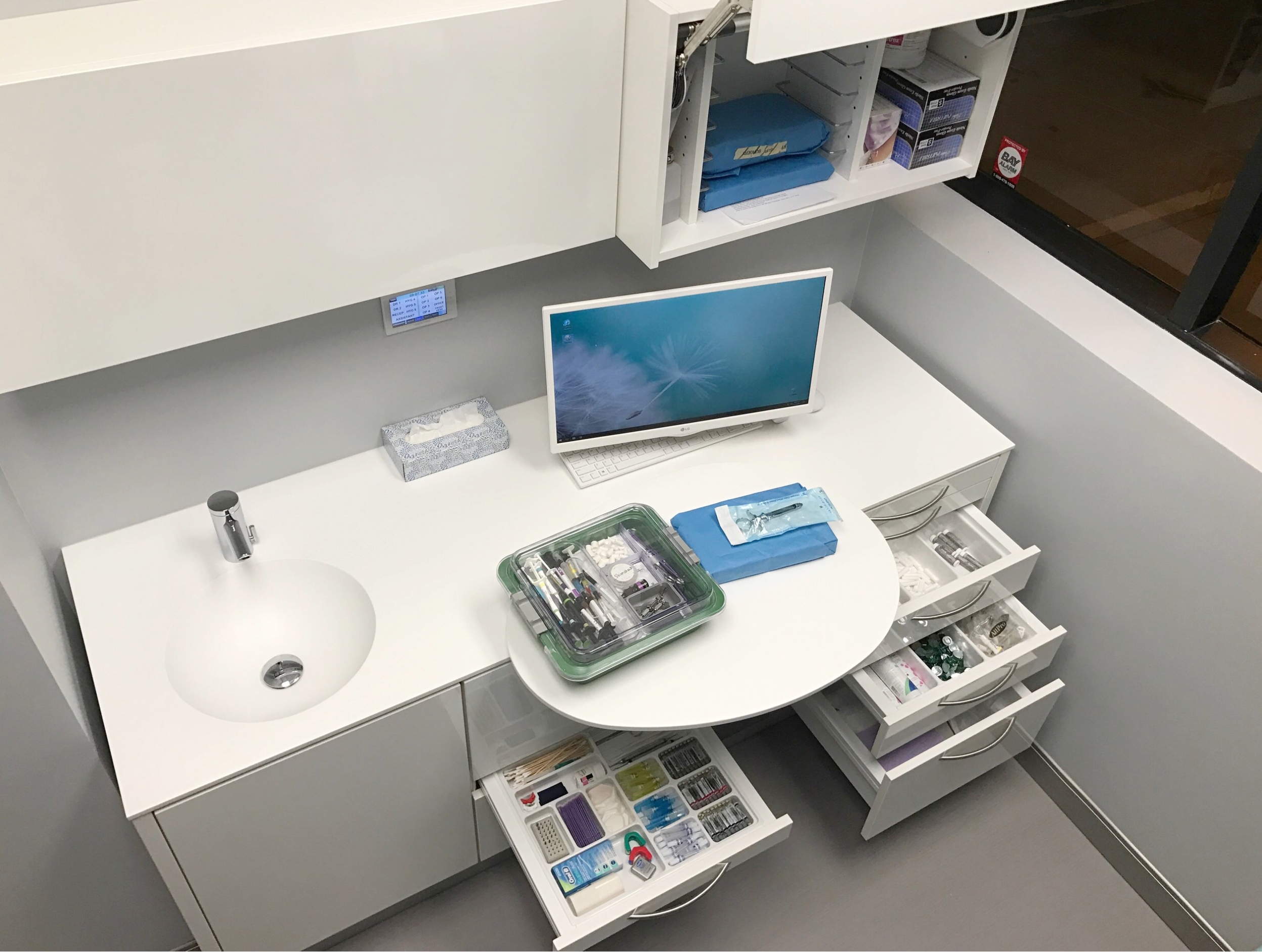
Tip #2 - Tubs, Casettes, and organized storage
Not only is it inefficient and costly to stock and store inventory in your operatories it clutters things up, slows down procedure changes, and operatory turn overs. An organized storage and tub preparation area can greatly enhance the clean organized feel.
Tub and cassette ready for the procedure with organized Componera rear hub by Kappler
Kappler SOS Consumable Storage Center
Tip #3 - Use a neutral base design and texture
White is as timeless as it gets. When I was a child I had a white shirt and still today I have a white shirt. White is clean crisp and inspires a sense of calm. White is timeless. This doesn’t mean create a sterile operating room feel. In fact just the opposite.
Utilizing different textures and natural materials in similar tones will avoid the cold or bland feel of 100% white or gray.
Avoid choosing dental equipment and cabinetry with speckles, patterns, fake wood, and colors that are not neutral. I often see offices with pink or green cabinets, fake wood all around, and speckles on every surface. Those are not timeless and they are expensive to replace which is why so many offices are just living with their outdated design and cluttered feel.
Minamilistic operatory design with textured wall paper and flooring
Minimalistic design in bedroom showing neutral palette and use of texture
Tip #4 - No side cabients
Side cabients not only make the room feel smaller but they add to the congested and messy feel that we are trying to avoid.
Open space and some breathing room go a long way when it comes to creating the ultimate patient experience.
Open airy operatory with textured drapes and no side cabients
Tip #5 - Integrate your table top devices
Dentsply Sirona Treatment Center’s can eliminate 90% of table top devices like: apex locators, endo motors, implant motors, IO cameras, CAD/CAM scanners, and X-ray sensors coming from the back cabinet amongst many others.
The less is more strategy can enhance your brand, productivity, and even improve the environment and cortisol levels in your practice.
Dentsply Sirona Treatment Center with integrated technology (note the lack of cords, cables and arms)
Actual yelp review from patient


